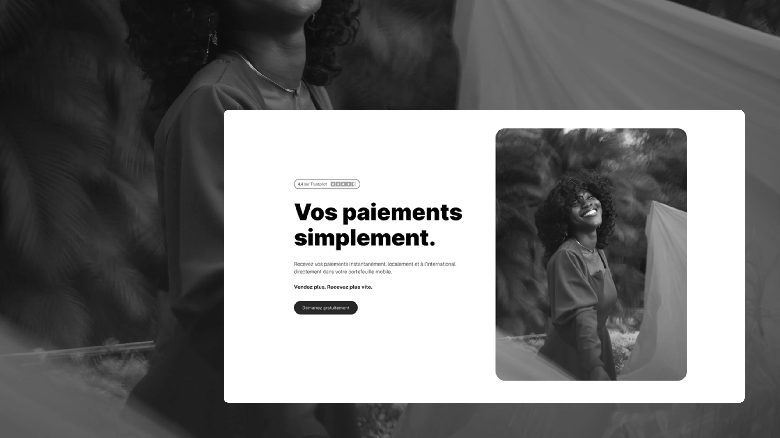
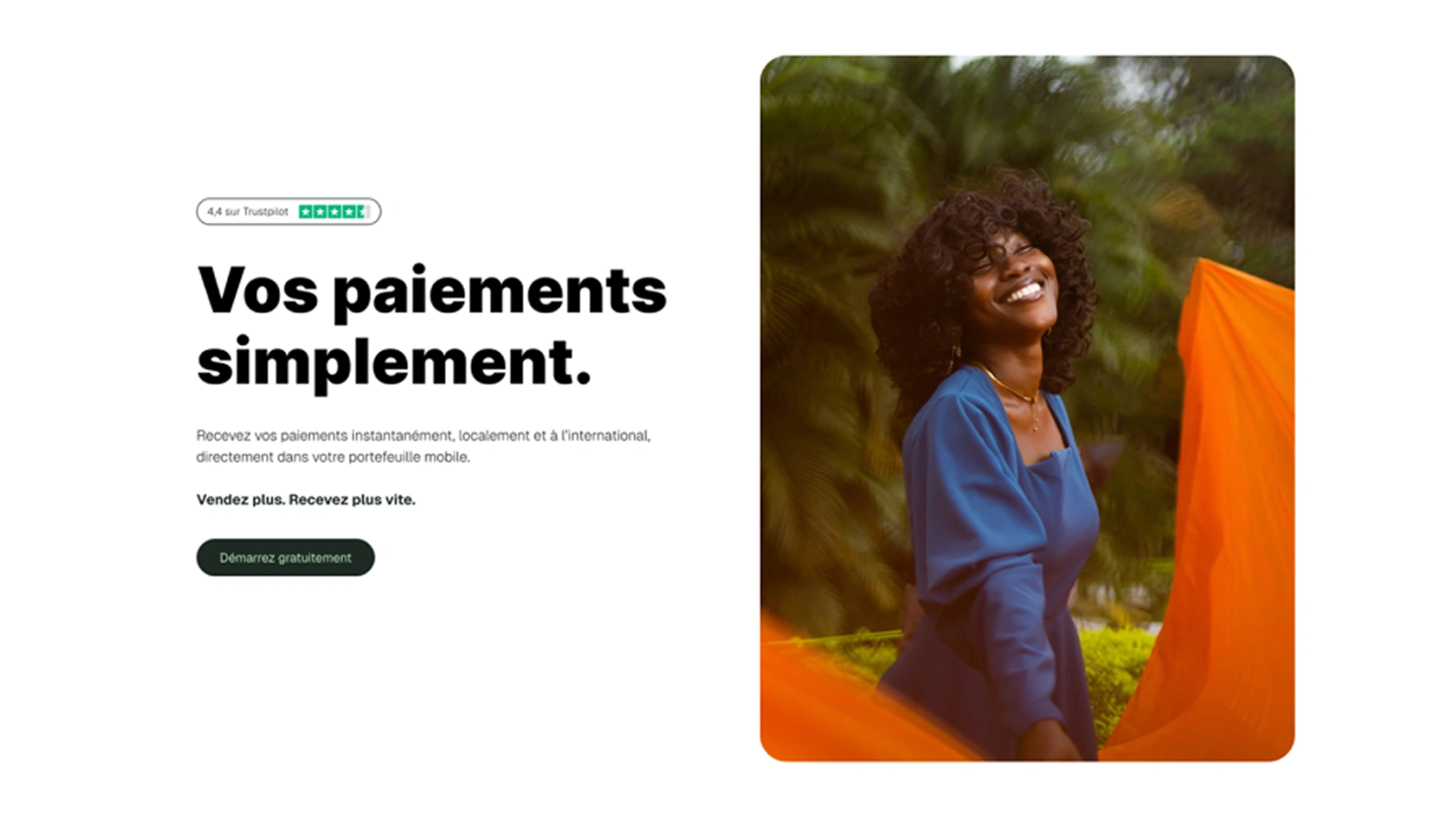





The context
Lygos lets people receive a payment straight to their mobile wallet, locally or from abroad. The platform covers more than thirteen countries and twenty-one carriers, and serves three audiences with distinct needs: merchants who sell online or in store, freelancers paid from abroad, and developers integrating the API.
Three audiences on a single home page is exactly the kind of situation where information architecture decides everything.
The problem
If the page talks to everyone at once, it talks to no one soon enough. The merchant is looking for a payment link. The freelancer wants to get paid from abroad. The developer is looking for an API. Making them all wait through the same paragraph loses two out of three.
The crux wasn’t to “explain Lygos better”. It was to make sure everyone found their door before having to understand the rest.
What I did
I prototyped the architecture around those three doors, then designed and built the site in Webflow. Each audience lands on a path made for them: payment links for merchants, international payments for freelancers, documentation for developers, without multiplying websites.
The product stays a single product. The page does the sorting, not the visitor.
The result
A 5-page website, delivered in 10 days and live at lygosapp.com. A prospect can tell in a few seconds whether Lygos is for them, before having to read the whole offer.