




The context
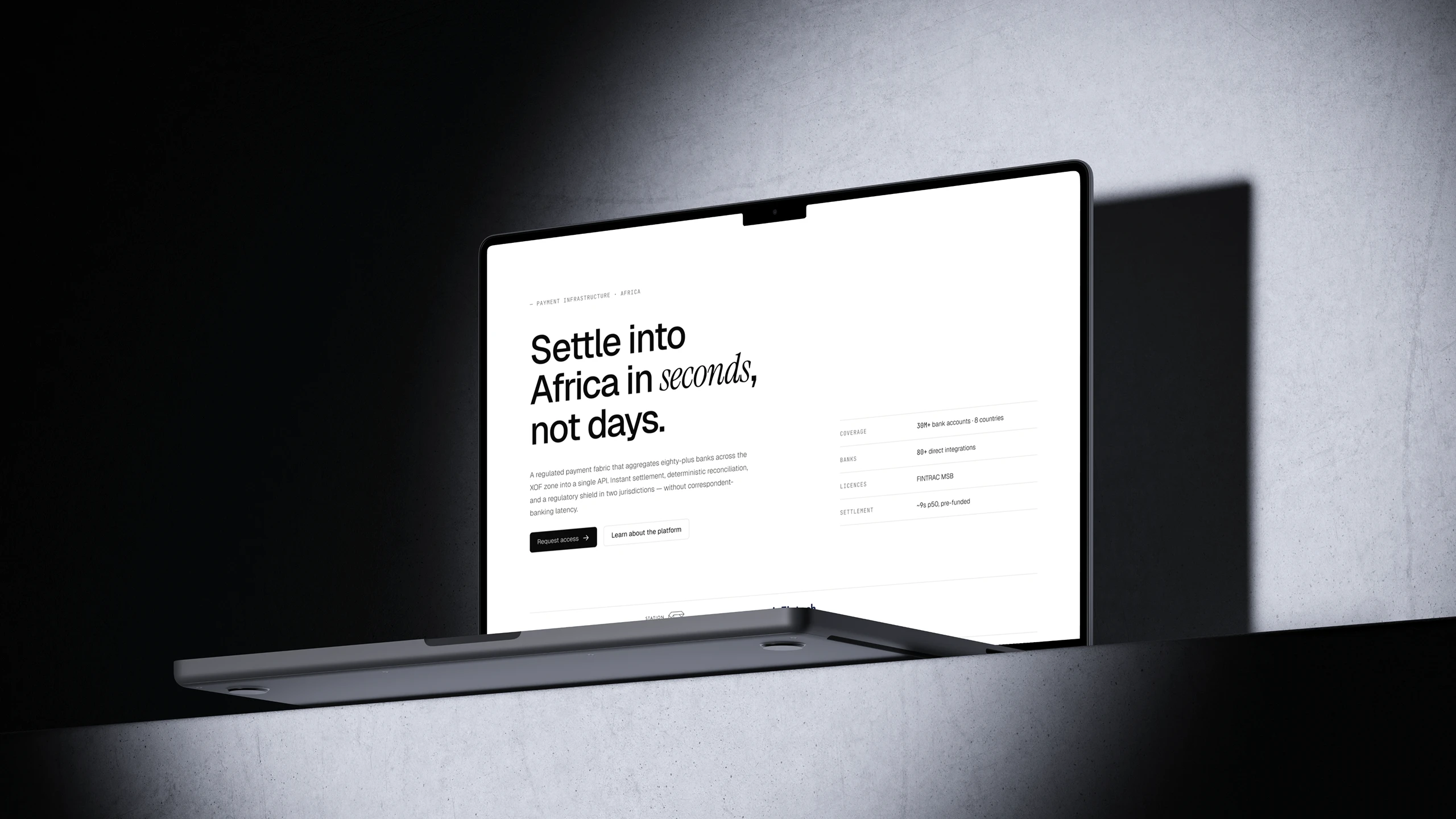
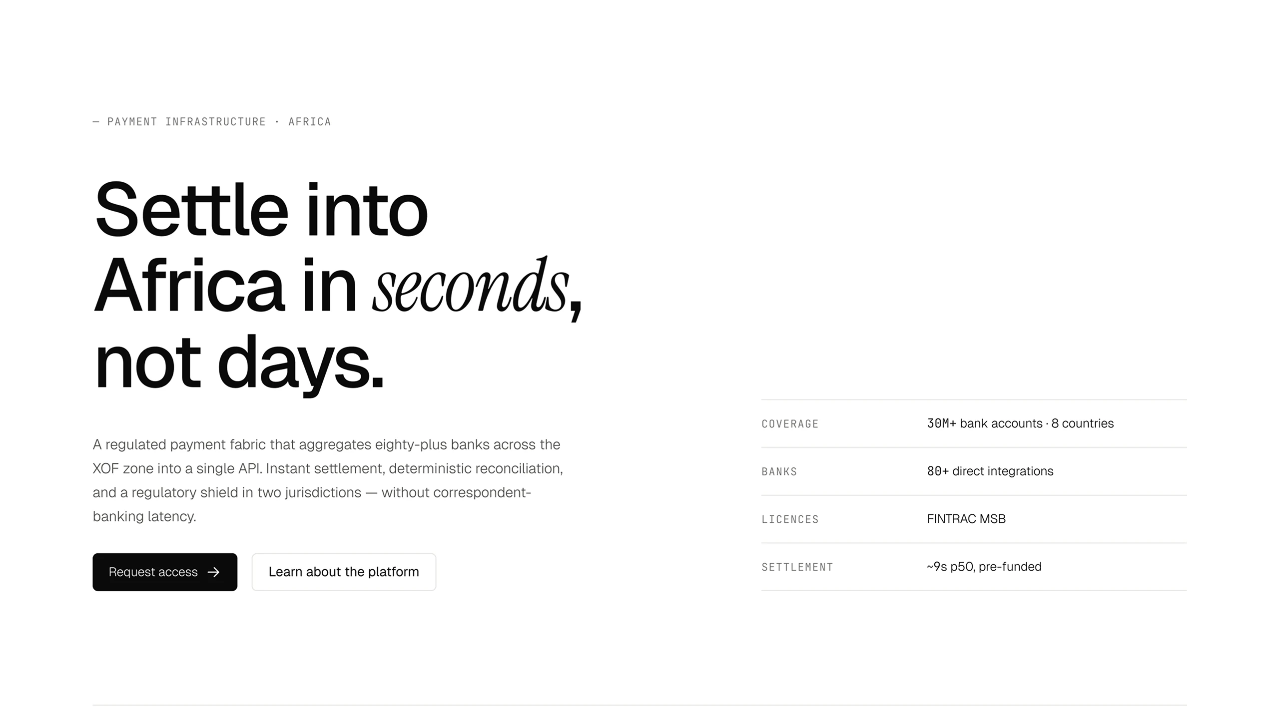
Xend connects more than eighty banks in the WAEMU zone behind a single API: a settlement that used to take days now happens in about ten seconds, across thirty million accounts and eight countries.
The problem
Their users and clients don’t judge a website by its looks. They want three answers before anything else: is it regulated, is it fast, and what happens when a transaction fails.
The site didn’t give them. In an industry that moves money, a website that makes people wait for those answers costs conversations that never happen.
What I did
I took the project back to the beginning.
The main work was on information architecture: making a technical offer readable without simplifying it so much that technical buyers lose interest.
The page now follows the order in which objections come up.
Coverage first: how many banks, how many countries, how many accounts. Then the platform, boiled down to three pillars. Then the life cycle of a transaction in four states, because the next question is always “what if it breaks?”. Then use cases, compliance with the licences named, an FAQ on funding and integration timelines, and only at the end, getting in touch.
Two exits rather than one: “Request access” for those ready to move forward, “Talk to compliance” for those who first need sign-off from their compliance team. They’re two different people in the client company, and sending them through the same button loses one of them.
I then designed the identity and the interfaces, and built a complete design system: components, variants and variables so the site stays consistent as the offer grows.
Finally, I built the site and launched it, technical side included: static hosting, SEO fundamentals, Open Graph images for sharing, performance testing before launch.
The result
A 5-page website, delivered in 10 days, that answers compliance and latency questions before anyone has to ask, and an identity that holds its own against far better-funded players. Xend now uses it as much to sell as to raise funds.