




The context
Before its B2B infrastructure, Xend served individuals sending money abroad.
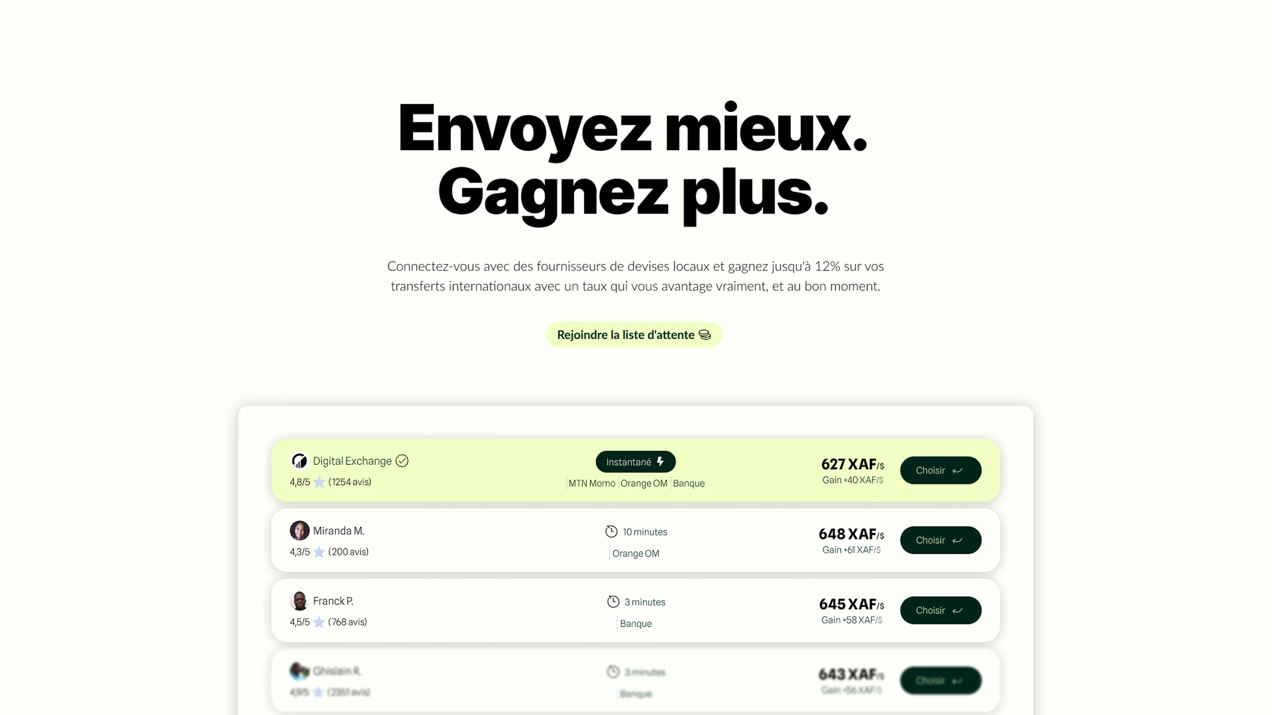
The idea: put local providers’ offers side by side, show the real exchange rate, and send the transfer without going through a traditional bank.
The product wasn’t a habit yet. It needed an identity, an interface, and a website solid enough, early enough, to build a waitlist.
The problem
People judge an international transfer on three things: the rate, the delay, and what happens to the money along the way. A website that starts by telling the company’s story before showing a concrete offer loses the comparison, and so the click.
There were no brand guidelines yet. The interface had to hold together a comparison tool, a four-step flow and a promise of security, without looking like a generic fintech landing page.
What I did
I designed the brand guidelines and the interfaces, then built the site in Webflow.
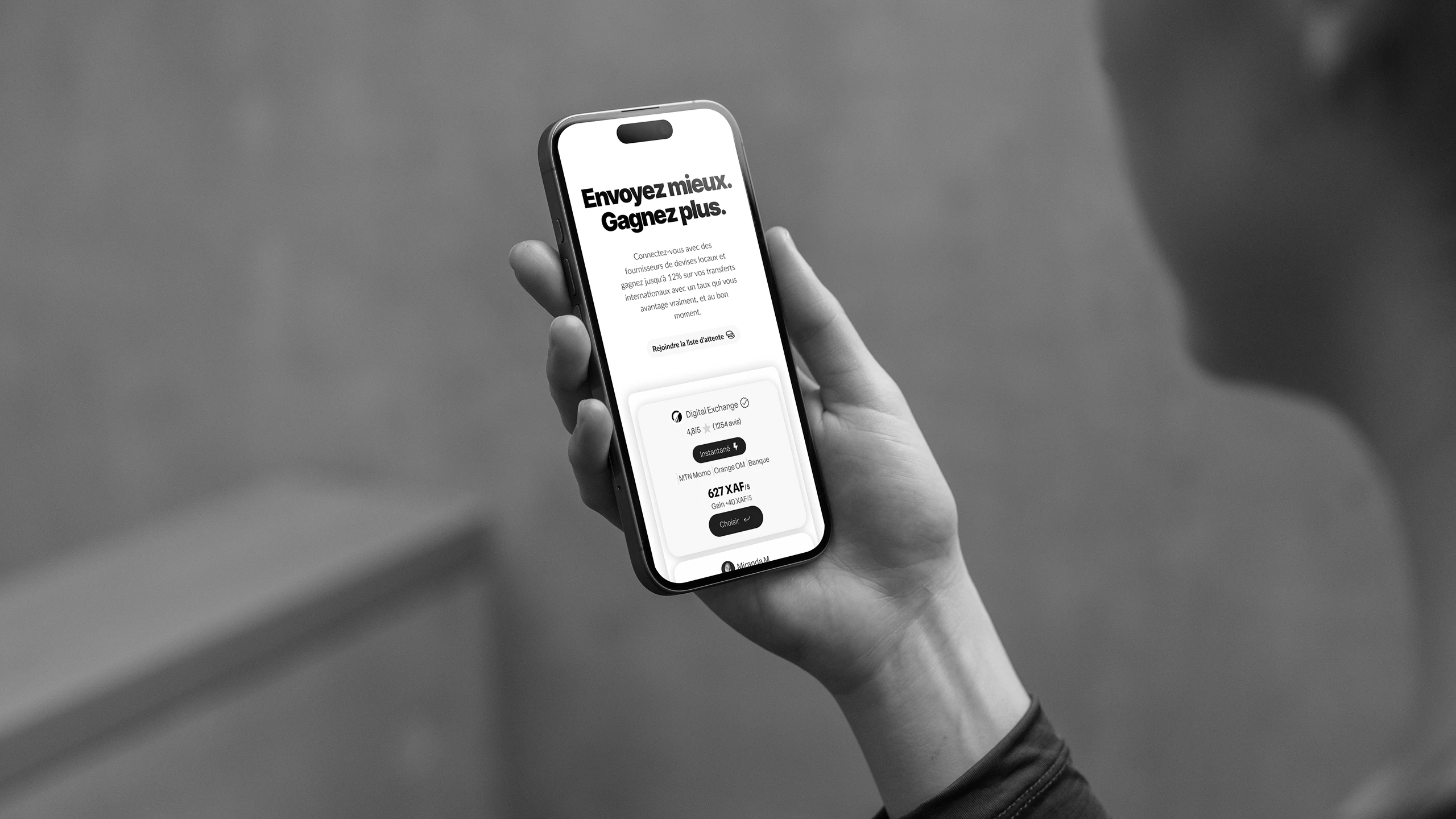
The page leads with the offer: a sample transfer, the rate, the delay, the provider. Only then how it works: choose the currency, the country, compare, pay. The waitlist closes the journey.
The result
A first one-page website, delivered, branded and live. This version served as the foundation before the repositioning toward payment infrastructure (the Xend 2025–2026 case study).