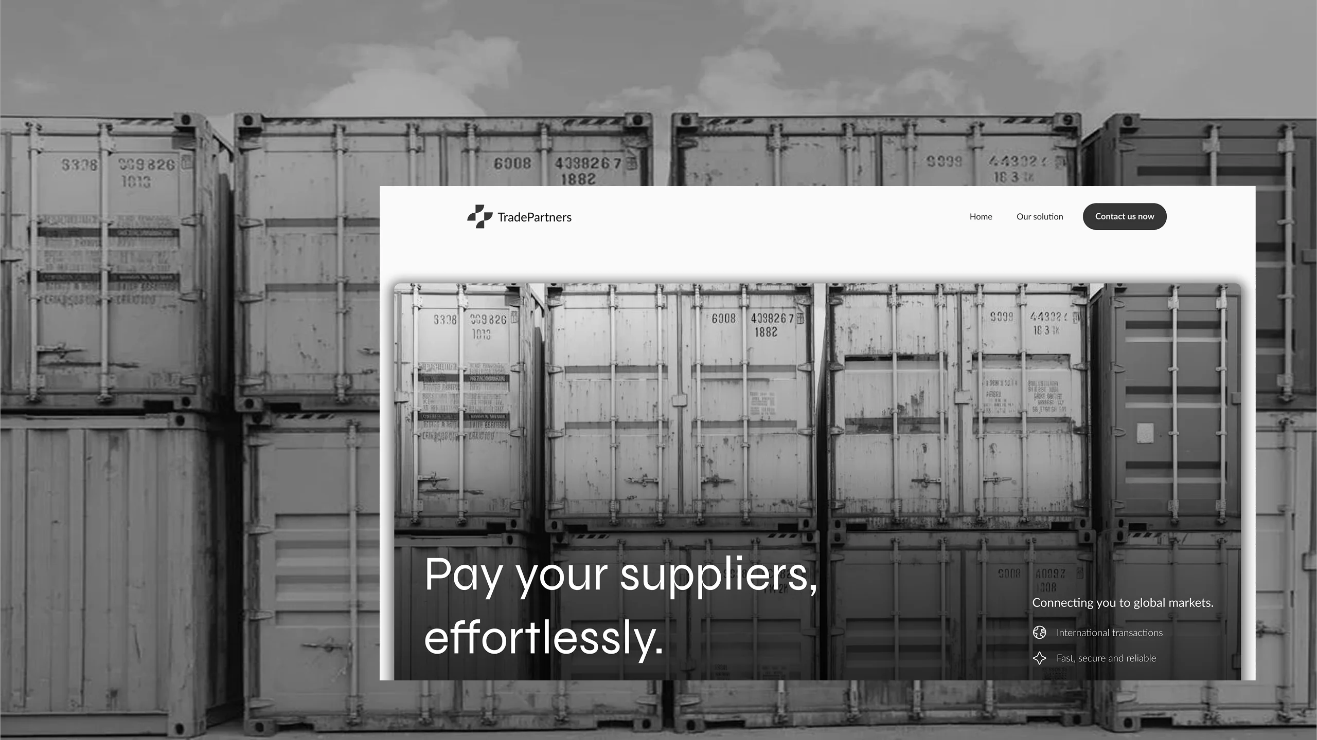
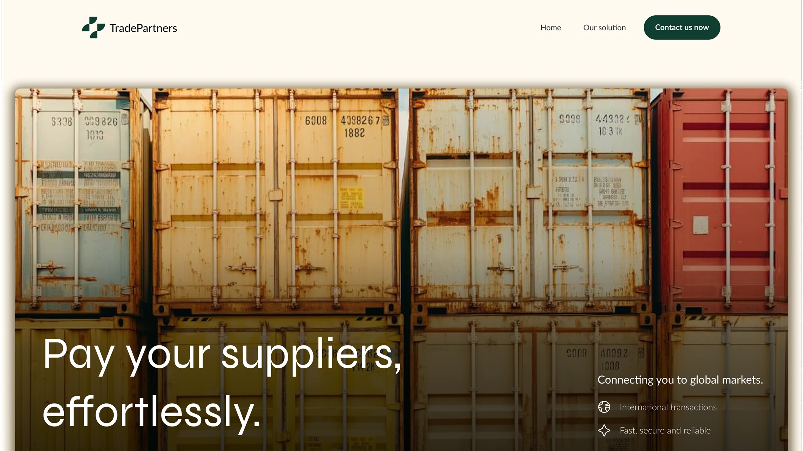





The context
Trade Partners lets African importers pay their foreign suppliers with no middleman, settling in local currency an invoice issued in dollars, euros or pounds. Business verification and account management come on top.
It’s a product where every step involves money and regulatory compliance. The flow has to be understood the first time by business owners who have neither the time nor the desire to decode an interface.
The problem
The mandate was an optimization: the product already existed. What was missing was a path short enough for someone who decides quickly. A first screen that explains the company rather than the payment, and the rest never gets read.
In this business, dropping off doesn’t look like a click on “back”. It looks like a closed tab, and a transfer that will happen somewhere else.
What I did
I tightened the site around the action: verify the business, share the invoice, pay in local currency. Less brochure, more sequence. Then I built the result in Webflow.
The three steps are visible before anyone has to look for them. The rest, partners, security, contact, comes afterwards, once the flow holds up.
The result
The live site fits on a single page and leads with the payment, not with the pitch. An importer can understand what to do before understanding who’s talking.